在所有的移动设备上都能显示
Can be displayed on all mobile devices
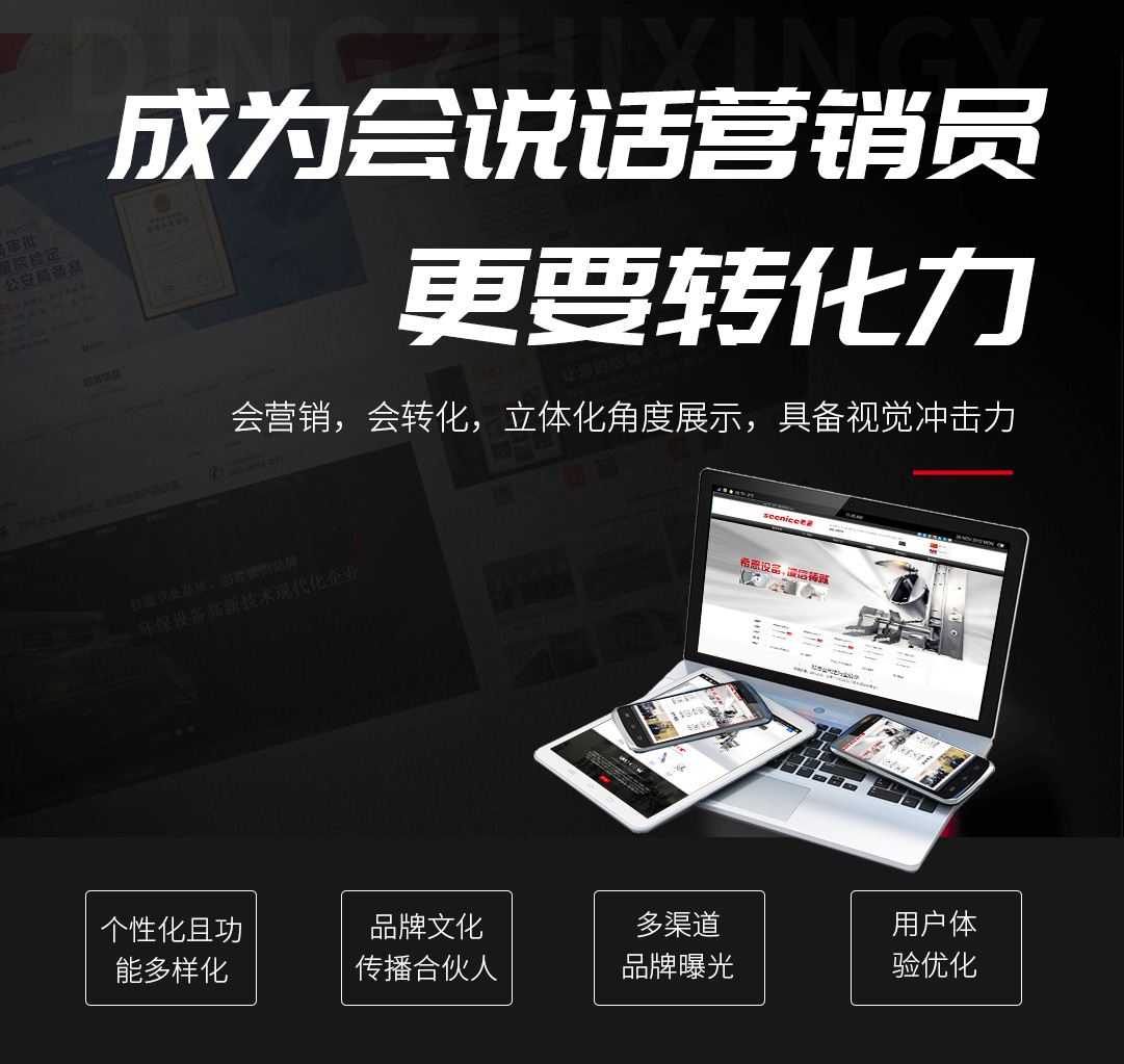
移动设备不光有手机,还有平板不同浏览器大屏幕等等,虽然手机是主要移动设备,但是也不能略过其它移动设备。
Mobile devices not only include mobile phones, but also tablets with different browsers and large screens. Although mobile phones are the main mobile devices, they cannot be ignored by other mobile devices.
在移动网站交付之前,需要进行测试。可以使用等响应式网站测试工具进行测试,确保在所有的移动设备上,网站都能正常显示。
Before delivering mobile websites, testing is required. You can use responsive website testing tools to ensure that the website can display normally on all mobile devices.
手机网站方便交互
Mobile websites facilitate interaction
手机网站的屏幕比较小,并且没有实体键盘,所以,一些在PC上很容易完成的操作,在手机上可能存在难度。
The screen of mobile websites is relatively small and there is no physical keyboard, so some operations that are easy to complete on a PC may be difficult on a mobile phone.
例如,表单填写中的日期填写,在PC上可以直接使用键盘输入,但是在手机上就要避免这种操作,可以通过滚动滑动的方式选择日期。总之,手机网站应该尽量减少用户使用键盘。
For example, when filling in a form, the date can be entered directly using the keyboard on a PC, but this operation should be avoided on a mobile phone. You can select the date by scrolling and sliding. In short, mobile websites should minimize the use of keyboards by users.
单层的导航深度设计
Single layer navigation depth design
不少PC网站大导航设计深度都在两层以上,甚至多大三级。但是手机网站应该避免这样的设计。
Many PC websites have large navigation designs with a depth of at least two layers, or even up to three levels. But mobile websites should avoid such designs.
一是手机去点击更多的层级,不太方便和精准。二是手机用户没有PC网站用户的耐心,他们不会去操作三次乃至更多,再找到自己需要的信息。
One is that clicking on more levels on a mobile phone is not very convenient and accurate. Secondly, mobile users do not have the patience of PC website users, they will not operate three or more times to find the information they need.
所以,手机网站的导航设计应该采用一键直达的设计思路,一个导航对应一个页面。
Therefore, the navigation design of mobile websites should adopt a one click direct approach, with one navigation corresponding to one page.
随时可以返回主页
You can return to the homepage at any time
因为上面说了,手机网站是单层深度设计,这会对用户返回首页造成一定的困难。
Because as mentioned above, mobile websites are designed with a single layer depth, which can cause certain difficulties for users to return to the homepage.
例如,用户已经处于一个页面,如果要返回主页,需要连续操作手机的返回键,这显然不太友好。
For example, if a user is already on a page and wants to return to the homepage, they need to continuously operate the return button on their phone, which is obviously not very friendly.
为此,手机网站的单页面,应该设计有返回主页的按钮,或者置顶的按钮,一键直达。特别是一些页面较长,更应该有这样的设计。
For this reason, the single page of mobile websites should be designed with a button to return to the homepage or a button at the top, with one click direct access. Especially for some pages that are longer, this design should be more appropriate.
搜索和填表是否容易
Is it easy to search and fill out forms
没有人喜欢使用一个虚拟的小键盘输入大量的文字,也是因为如此,手机语音可以在手机上大放其彩。
No one likes to use a virtual small keyboard to input a large amount of text, and that's why mobile voice can shine brightly on the phone.
而一些场景又是必须要使用键盘输入的。例如表单的输入,此时,设计方面就需要进行转化,将键盘输入转化为滑动操作输入,如上文提到了日期滑动选择。
And some scenarios require keyboard input. For example, for form input, in this case, the design aspect needs to be transformed from keyboard input to sliding operation input, as mentioned earlier in the date sliding selection.
还有一个办法就是进行智能过滤和提醒,例如电商手机网站的搜索输入,只需要输入少量的信息,就会跳出更多的选项,用户只需要选择即可。
Another method is to perform intelligent filtering and reminders, such as for search input on e-commerce mobile websites. With only a small amount of information input, more options will pop up, and users only need to choose.
图像的缩放
Scaling of images
手机网站的图像设计成为缩放模式,这是合适的。因为屏幕较小,一些用户希望能够查验图片的细节,而进行图像的放大。特别是电商手机网站设计,不少电商用户喜欢去看细节。
The image design of mobile websites should be in zoom mode, which is appropriate. Due to the small size of the screen, some users hope to be able to examine the details of the image and enlarge it. Especially in the design of e-commerce mobile website, many e-commerce users like to look at the details.
所以,网站设计师需要对图像的质量和图像大小进行把握和平衡。
So, website designers need to grasp and balance the quality and size of images.
所有的内容均可在移动设备上播放
All content can be played on mobile devices
某些类型的内容,尤其是视频,可能不能在所有移动设备上播放。例如,Flash不能在很多移动设备上运行。这也适用于不支持的视频格式。如果你的内容不能播放,这对于手机用户来说是非常令人沮丧的,并且会破坏体验。所以,对于所有音频和视频内容,坚持使用HTML5标签可能是一个更好的主意。
Some types of content, especially videos, may not play on all mobile devices. For example, Flash cannot run on many mobile devices. This also applies to unsupported video formats. If your content cannot be played, it is very frustrating for mobile users and can disrupt the experience. So, for all audio and video content, insisting on using HTML5 tags may be a better idea.
复杂任务的可转移
Transferability of complex tasks
移动网站的好处是随时可以访问,但是一些复杂任务,用户希望在PC上完成,或者处于隐私的考虑,不会在手机上使用。所以手机网站需要满足用户的这种需求。
The advantage of mobile websites is that they can be accessed at any time, but for some complex tasks that users hope to complete on their PC, or for privacy reasons, they will not use them on their phone. So mobile websites need to meet the needs of users.